Adding Visualizations
To create a new visualization (bar chart, pie chart, etc.), drag an object from the left-hand Charts or Custom objects panel to the sheet.
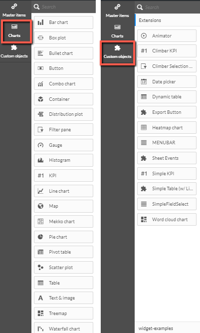
The table below provides brief descriptions of the available charts:
Chart | Description |
Bar chart | The bar chart displays a bar for each dimension value. The bar length corresponds to its numerical measure value. |
Box plot | The box plot is suitable for comparing range and distribution for groups of numerical data, illustrated by a box with whiskers, and a center line in the middle. |
Bullet chart | The bullet chart displays a gauge with extended options. Bullet charts can be used to visualize and compare performance of a measure to a target value and to a qualitative scale, such as poor, average, and good. |
Button | Buttons are suitable for adding quick links for easy selection and navigation in your app and for reloading data. |
Combo chart | The combo chart combines bars and lines in the same chart. The bars and lines have different axes to enable comparisons of percentages and sums. |
Container | The container is an object that lets you add visualizations in a limited space using tabs. You can also show or hide the visualizations inside the container based on conditions. |
Distribution plot | The distribution plot is suitable for comparing range and distribution for groups of numerical data. Data is plotted as value points along an axis. |
Filter pane | The filter pane allows you to control what data is shown in the visualizations on a sheet. The filter pane can filter the data of several dimensions at once. |
Gauge | The gauge is used to display the value of a single measure lacking dimensions. |
Histogram | The histogram is suitable for visualizing distribution of numerical data over a continuous interval, or a certain time period. The data is divided into bins. |
KPI | The KPI is used to present central performance figures. You can add a link to a sheet. |
Line chart | The line chart displays data lines between values. Line charts are often used to visualize trends in data over intervals of time. |
Map | The map is used to combine geographical data and measure values, such as sales in a region or store. |
Mekko chart | The mekko chart is suitable for comparing groups, while being able to compare category items contained within these groups. The dimension axis shows the groups, while the measure axis shows the normalized percentage value for each category item. The size of each group shows its value. |
Pie chart | The pie chart shows the relationship between a single dimension and a single measure. |
Pivot table | The pivot table presents dimensions and measures as rows and columns of a table. The pivot table allows you to analyze data in multiple dimensions simultaneously. The data in a pivot table can be grouped based on a combination of the dimensions, and partial sums can be shown. |
Scatter plot | The scatter plot presents values from two measures. This is useful when you want to show data in which each instance has two numbers, for example, country (population and population growth). An optional third measure can be used and is reflected in the size of the bubbles. When showing large data sets colors will be used instead of bubble size to represent the measure size. |
Table | The table displays values in record form so that each row of the table contains fields calculated using measures. Typically, a table includes one dimension and multiple measures. |
Text image | Use the text image visualization to add text, images, measures and links to a sheet. To add an image, enable the Use Background Image setting, click on the image, and select an image from the list or add your own image by clicking the Upload media option (then click the image and the plus icon). |
Treemap | The treemap shows hierarchical data. A treemap can show a large number of values simultaneously within a limited space. |
Waterfall chart | The waterfall chart is suitable for illustrating how an initial value is affected by intermediate positive and negative values. The starting and the final values are represented by whole bars, and intermediate values by floating bars. You can also show subtotals in the chart. |
The table below provides brief descriptions of the available extensions in the custom objects:
Extensions | Description |
Animator | Animates the changes in values in your visualizations over a range of values. |
Climber KPI | Presents KPIs, such as trendlines and navigation from your dashboard to details on other sheets. |
Climber Selection Bar | Horizontal selection bar with initial selection capabilities via clicks and swipes. |
Date picker | Select a single date or a range of dates from a calendar. |
Dynamic table | A table with support for sortable columns and the ability to limit the number of records that are retrieved. |
Export Button | Export data to an XLS or CSV file without having to load the data to the memory, which impacts performance. |
Grid chart | A grid from two dimensions with symbols of varying size based on a measure. |
Heatmap chart | A two-dimensional heatmap. |
Menubar | A menu bar with vertical and horizontal buttons, selections and trigger-based actions. |
QS Custom Report | This object is for internal purposes and cannot be edited. |
Sheet Events | Trigger actions (related to fields, bookmarks and variable) when a dashboard is opened. |
Simple KPI | Display one or more KPIs using measures and one dimension. |
Simple Table (w/ Links) | A simple table with conditional logic for detecting hyperlinks, images and raw HTML input. |
SimpleFieldSelect | Enables field and variable selections, including the ability to set the background color of the dashboard, hide the title bar, modify all borders, remove the Insights button and more. |
Word Cloud Chart | Visualize text data or free form text. Single words are displayed with their size based on a measure value. You can customize your chart with different shapes, fonts, layouts, and color schemes. |
Video player | Embed and play videos directly in dashboards. |