Sample Workflows
Creating a Dashboard
Create a new sheet as explained in Creating a New Sheet (Dashboard), then follow the steps described below.
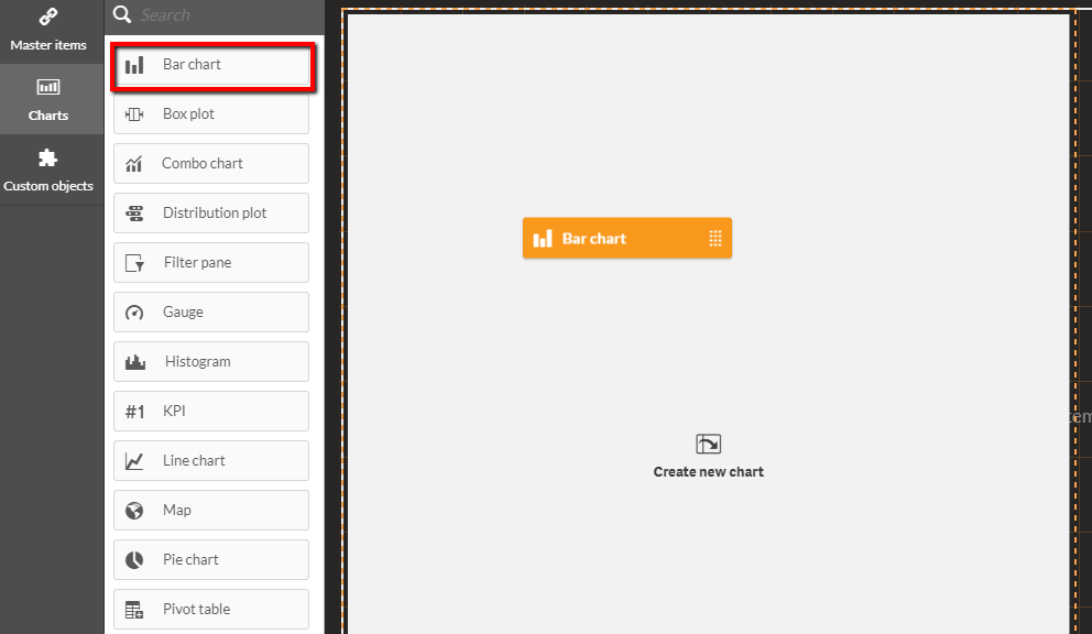
Drag a Bar chart to the sheet.
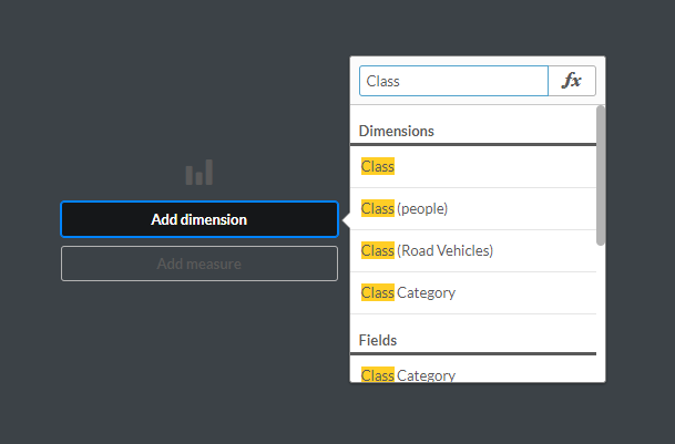
Click Add dimension and select Class.
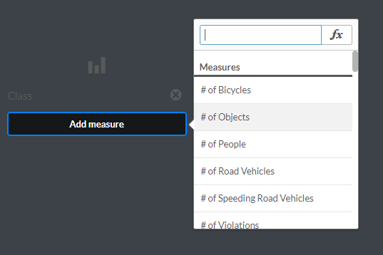
Click Add measure and select # of Objects.
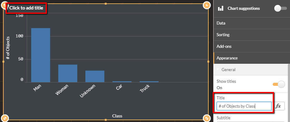
Add a title to the chart.
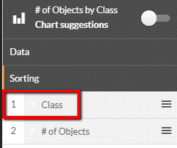
Change sorting by dragging items on the right-hand menu, so that Class precedes # of Objects.
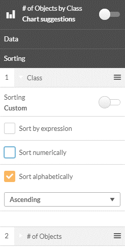
Expand Class, select Custom sorting and check Sort alphabetically.
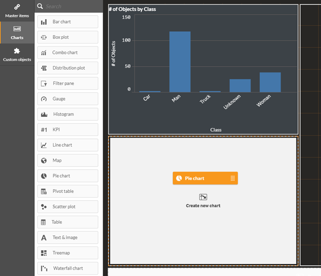
Drag a Pie chart onto the dashboard.
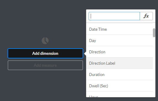
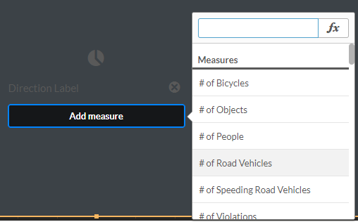
Click Add dimension and select Direction Label.
Click Add measure and select # of Road Vehicles.
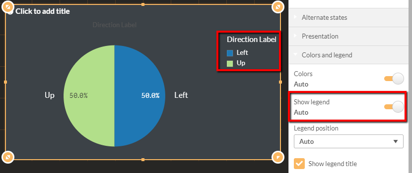
If you do not see a legend, change Show Legend to Enabled.
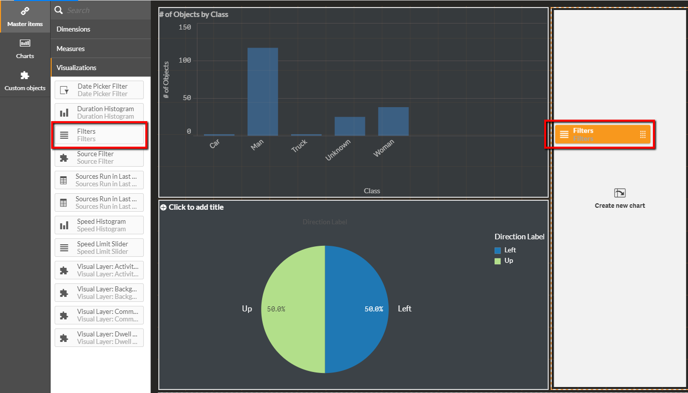
Drag the Filters visualization to the dashboard.
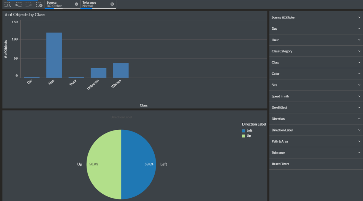
Click the Done editing button.

Congratulations! You’ve created a new dashboard.
Multi-Camera Dashboard
To create a Multi-Camera Dashboard that presents object counts from multiple sources in the same sheet, follow the steps described below:
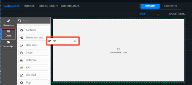
Drag the KPI chart onto the dashboard.
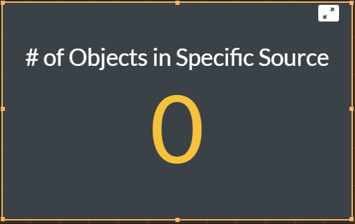
Select the # of Objects in Specific Source measure.
The result will currently be 0 objects.
Unlink the measure within the visualization object by clicking the unlink (
 ) icon.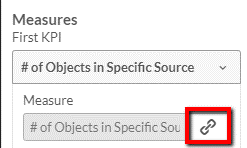
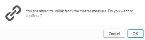
Click OK.
In the Expression field, click the function (
 ) button.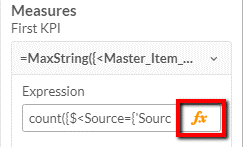
Replace the string
SourceExamplewith the requested Source name.

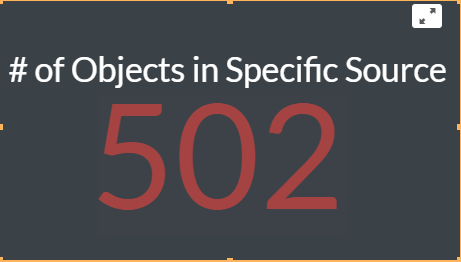
See the result.
Multi-Path, Area, or Line Crossing Dashboard
To create a Multi-Path, Area, or Line Crossing Dashboard that presents object counts from multiple paths/areas/line crossings in the same sheet, follow the steps described below:
Drag the KPI chart onto the dashboard.
Select the # of Objects in Specific Source and Custom Dimensions measure.
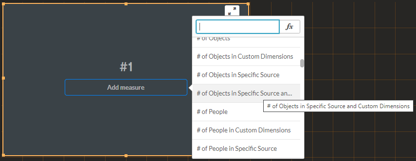
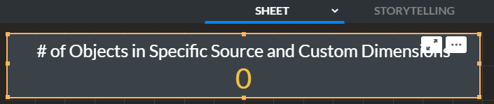
The result will currently be 0 objects.
Unlink the measure within the visualization object by clicking the unlink (
) icon.
Click OK.
In the Expression field, click the function (
) button.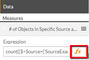
Replace the string
SourceExampleandCustomDimensionsExamplewith the requested source and custom dimension name.

See the result.
