Out-of-the-box Visualizations
You can reuse common visualizations by dragging an object from the left-hand side Master items >Visualizations menu to the sheet.
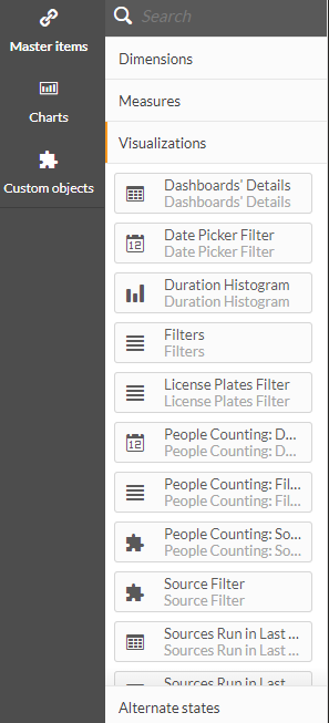
Currently, the available out-of-the-box visualizations are:
Visualization name | Description |
Dashboards’ Details | A table that presents all the names and IDs of the dashboards. This is useful for changing the default dashboard that opens when opening the RESEARCH module. To change the default, contact your administrator. |
Date Picker Filter | Add this filter to select a specific time range within a sheet. People counting has its own visualization for this functionality. |
Duration Histogram | Histogram (spread) chart of different objects’ durations. |
Filters | Add these filters to filter different attributes within a sheet: Source Group, Source, Day, Hour, Class Category, Class, Color, Size, Speed, Dwell (Sec), Direction, Direction Label, Custom Dimensions, Face Mask, Tolerance, Reset Filters. People counting has its own visualization for this functionality. |
License Plates Filter | Add this filter to select license plates from a list (or search). |
People Counting: Date Picker Filter | Add this filter to select a specific time range within a sheet for people counting. |
People Counting: Filters | Add these filters to select different People Counting attributes within a dashboard, such as People Counting: Hour (Num). |
People Counting: Source Filter | This lets you set preset dashboard filters for people counting. For more information, see the Source Filter item below. |
Source Filter | This lets you set preset dashboard filters (across users). Note that this same behavior can now be achieved by selecting a source in the properties of the Actions section. 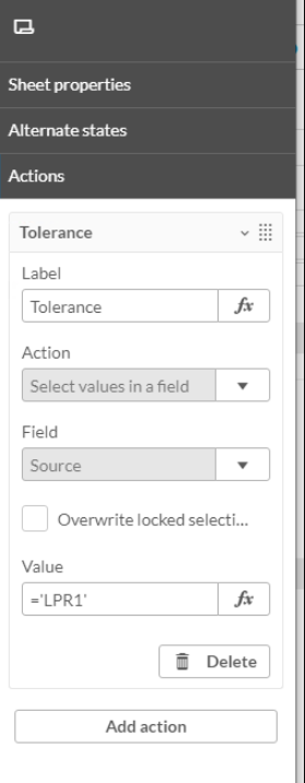 This visualization remains in the product for backward compatibility. People counting has its own visualization for this functionality. |
Source Run in Last 30 Days | Add this table to monitor the number of objects loaded per Source and Date. The table is sorted by the last update date and contains only sources whose data was loaded in the last 30 days. |
Source Run in Last 30 Days (by hour) | Add this table to monitor the number of objects loaded per Source, Date and Hour. The table is sorted by the last update date and contains only sources whose data was loaded in the last 30 days. |
Speed Histogram | Histogram (spread chart) of different objects’ speeds. |
Speed Limit Slider | Use the Speed Limit Slider together with the # of Speeding Road Vehicles measure to count Road Vehicles whose speed exceeds the limit specified on the slider. |
Time Range Filter | The dashboard will automatically open filtered according to the time range that you set using this visualization. This filter is useful when you want a dashboard to always show a certain time range relative to today without having to manually set the timer range every time the dashboard is opened. The Time Range filter will be displayed in the top left of the dashboard.  The default filter is the last 30 days. To change the default:
|
Visual Layer: Activity Heat Map | Add the activity heat map image of a RESEARCH source. If a source is not selected, BriefCam will display the most recent image that comes first alphabetically. To display the heat map for a different source, add the Filters visualization and select the required source. See also Displaying a Specific Visual Layer. Note that the visual layer visualizations are only affected by the Source and Date filters. |
Visual Layer: Background Changes | Add the background changes heat map image of a RESEARCH source. If a source is not selected, BriefCam will display the most recent image that comes first alphabetically. To display the background changes for a different source, add the Filters visualization and select the required source. See also Displaying a Specific Visual Layer. Note that the visual layer visualizations are only affected by the Source and Date filters. |
Visual Layer: Common Paths | Add the common paths heat map image of a RESEARCH source. If a source is not selected, BriefCam will display the most recent image that comes first alphabetically. To display the common paths for a different source, add the Filters visualization and select the required source. See also Displaying a Specific Visual Layer. Note that the visual layer visualizations are only affected by the Source and Date filters. |
Visual Layer: Dwell Heat Map | Add the dwell heat map image of a RESEARCH source. If a source is not selected, BriefCam will display the most recent image that comes first alphabetically. To display the dwell heat map for a different source, add the Filters visualization and select the required source. See also Displaying a Specific Visual Layer. Note that the visual layer visualizations are only affected by the Source and Date filters. |
